
Individual project · Pitch 2025


Fuego de Gracia
Signature Grill
Pitch, 2025. This project never caught fire: it stalled in negotiations with the management. We are publishing it because concepts this well loved do not get archived — they get shown. This is what we proposed.
The starting point
From chef-driven kitchento chef-driven grill
Gracia was a chef-driven restaurant. The brief: turn it into a signature grill — bring charcoal, smoke and embers into a house that already knew about finesse. The challenge was not changing the name: it was changing the element without losing the soul.
La Gracia sigue, pero ahora con la fuerza del fuego.
The brand does not erase its history: it sets it alight. That is why the intentions were physical, not digital — we burned real paper. Real charred edges, real ash. Those textures became the graphic system. Nothing simulated: the fire was invited into the studio.
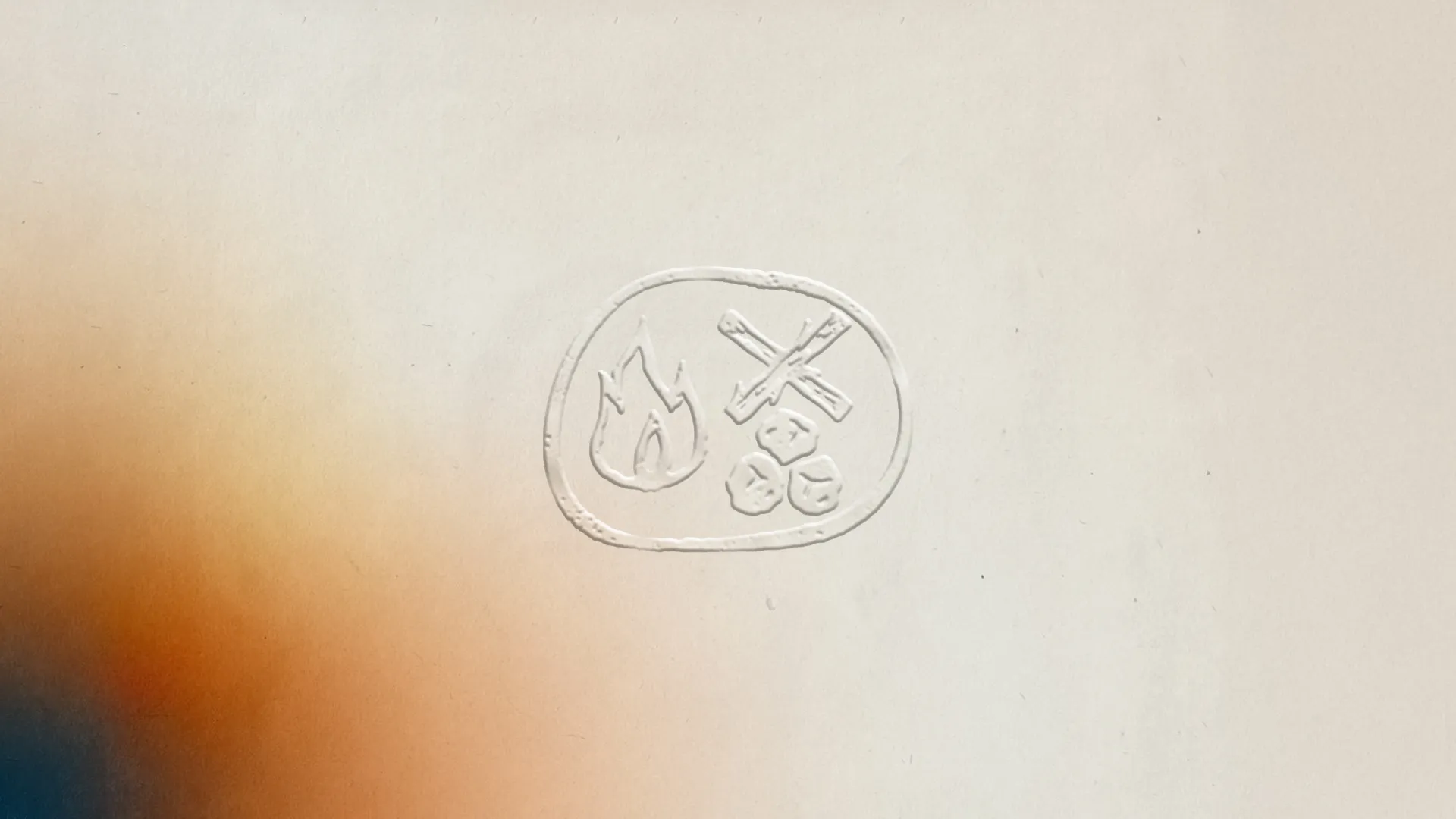
Blind emboss on paper — no ink
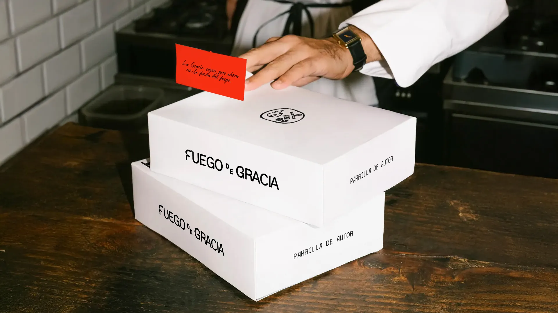
Logotype construction
The logotype foregrounds the initials F and G, drawn with terminals that echo the movement of fire. The letters can stand alone as symbols, reinforcing versatility and recall. The brand draws on primitive fire, understood as the creative spark and the element that transforms.
Visual language
The icon — fire, wood and charcoal — reinforces the rustic, handmade nature of the grill. The palette combines red, brown, beige and black to balance energy, earthiness and elegance. Fire does not only consume: it purifies and gathers. It is the center of the visual language.
Fire · wood · charcoal
Typography — CS Daine Mono Drawn
Typography
The secondary monospaced typeface carries simplicity and rusticity, evoking the handmade and the authentic. Its ordered structure adds modernity: a balance between tradition and the contemporary, right for a “Signature Grill”.
Composition & balance
The graphic system balances the rustic and the modern. The logotype is stable and legible at any size; the icon adds expression. The palette sets the hierarchy: red as energy, brown as warm base, beige as neutrality and black as elegant support. It all converges into a brand that is solid, authentic and refined.
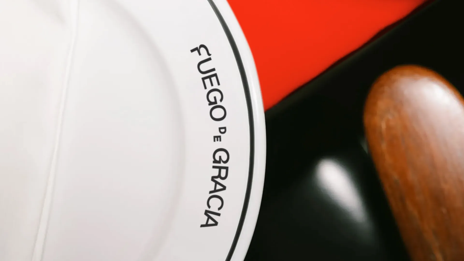
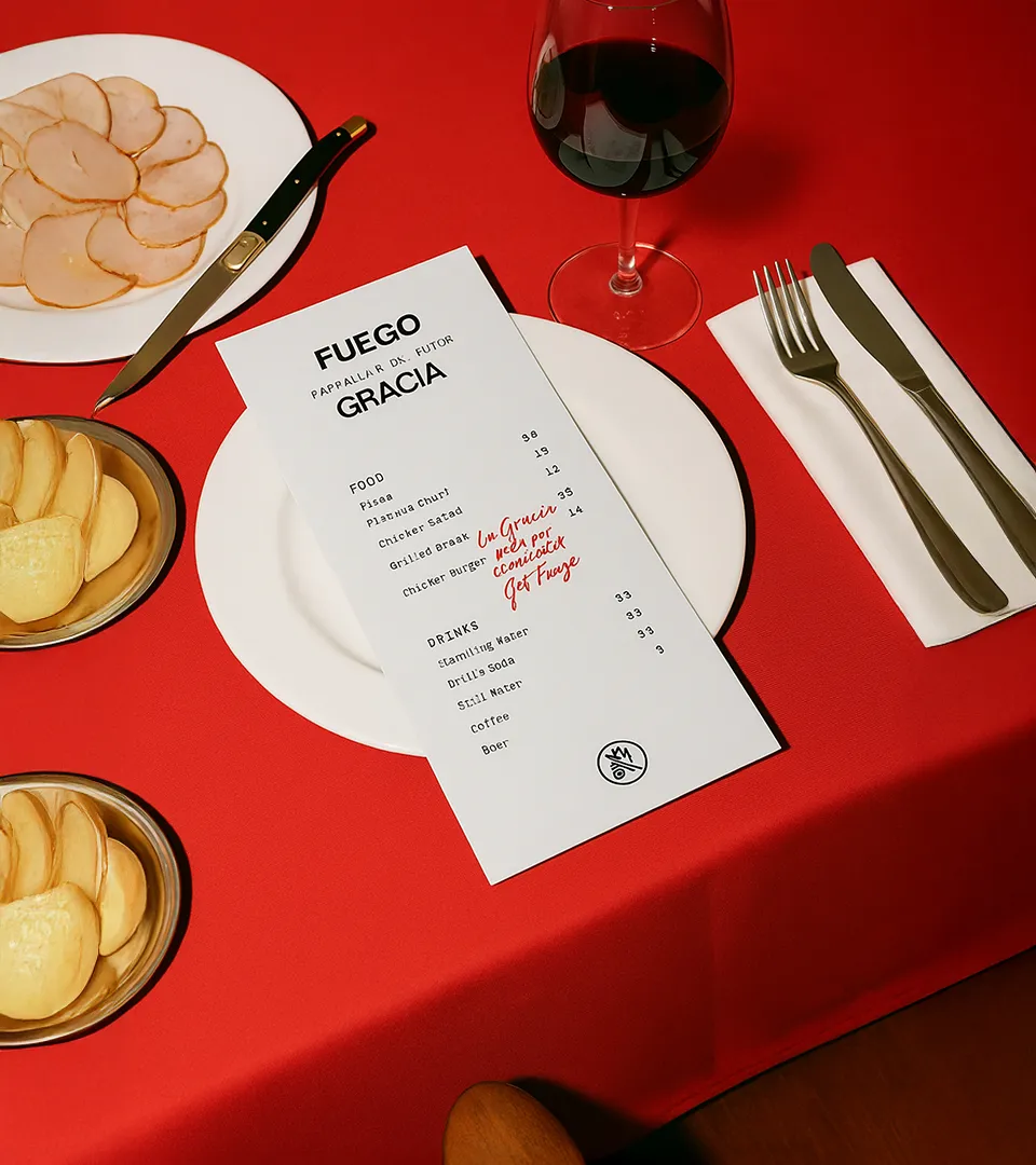
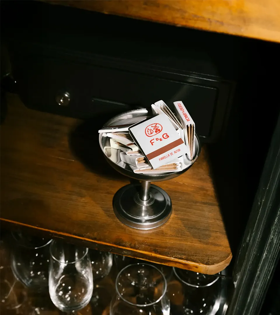
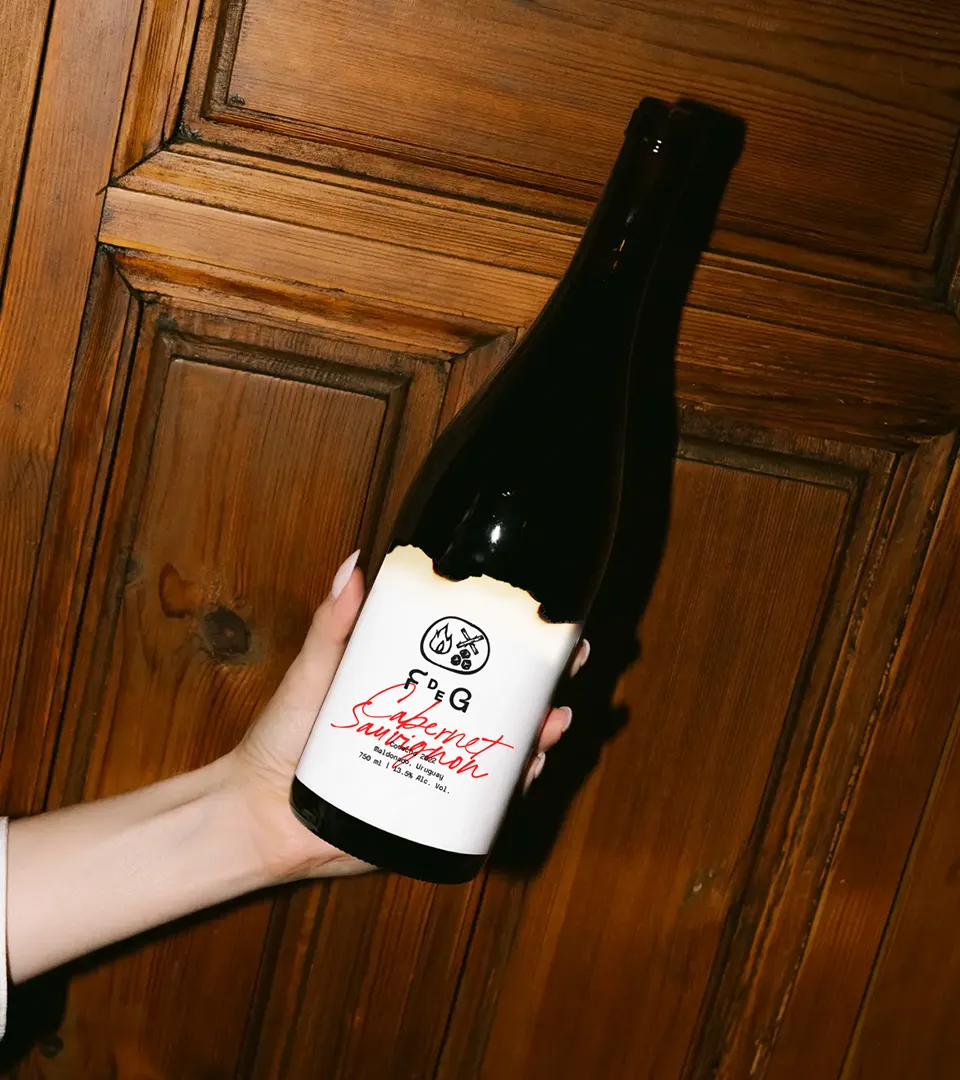
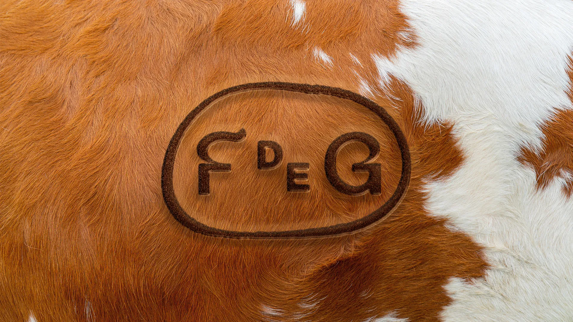
Branded with fire, like cattle
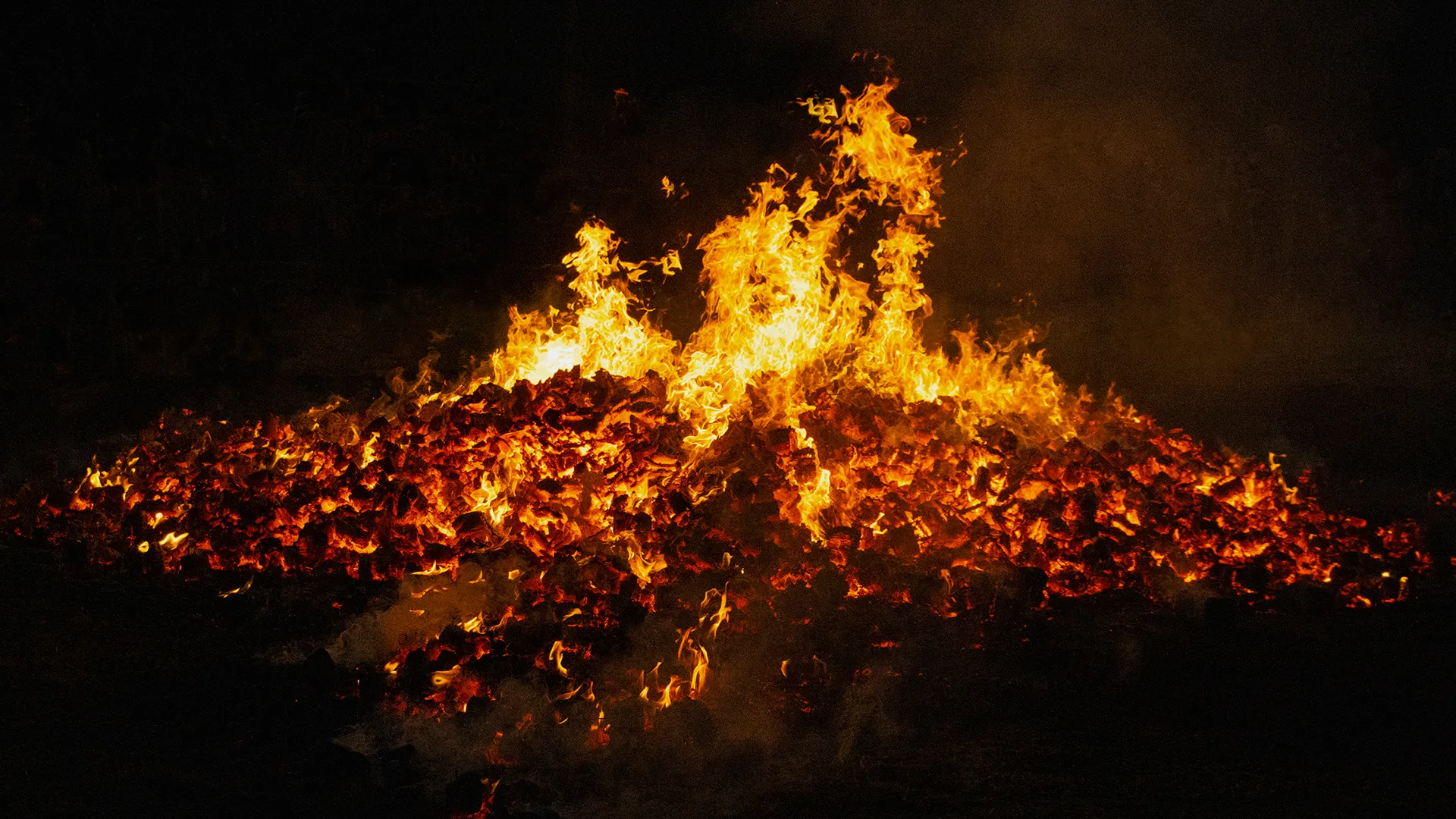
El fuego no consume, refina.Y en el dolor, la gracia transforma.
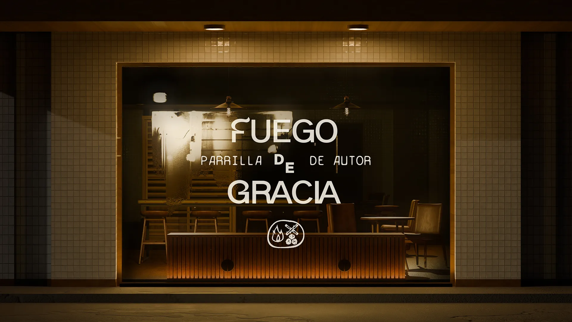
La casa, de noche — mockup
Logbook — straight from the phone, no retouching
The print tests and the first burn, documented on a phone right there on the worktable. The edge of every piece was burned by hand, one by one: no texture here is digital.
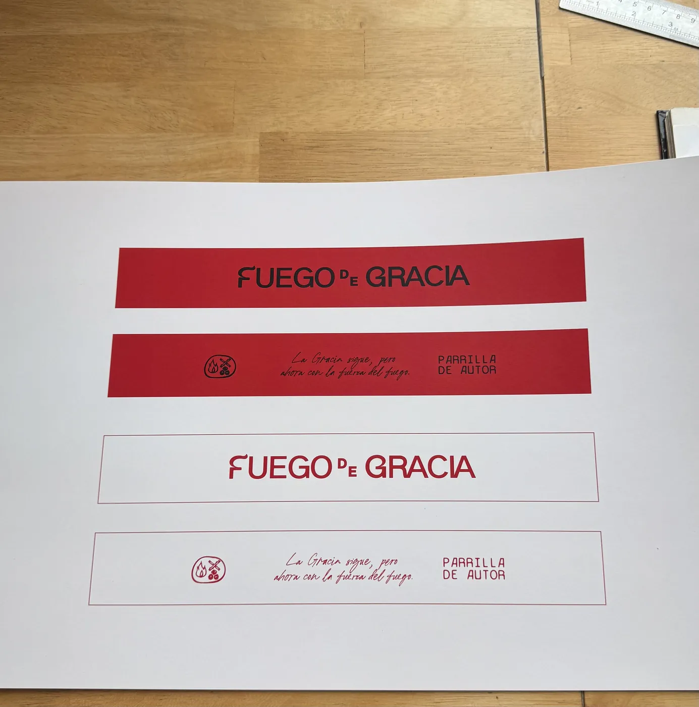
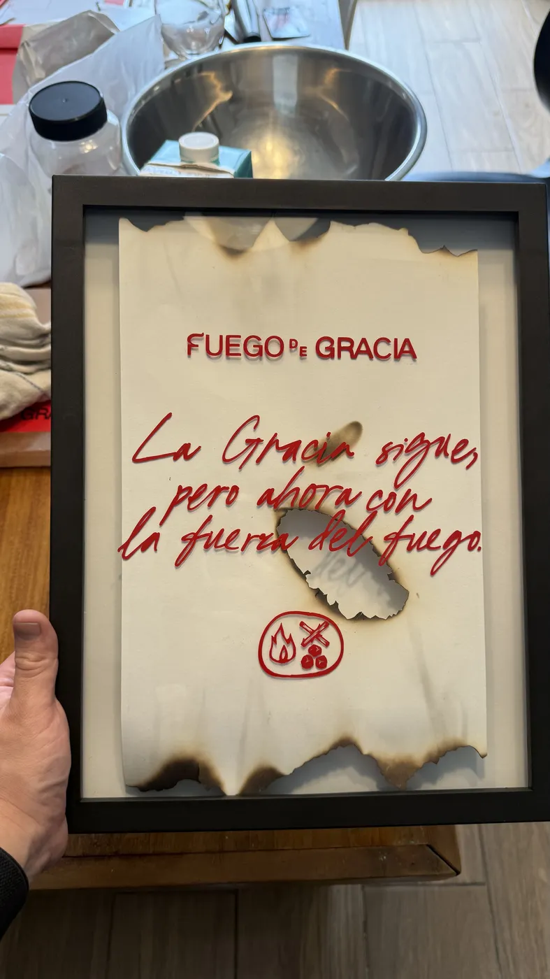
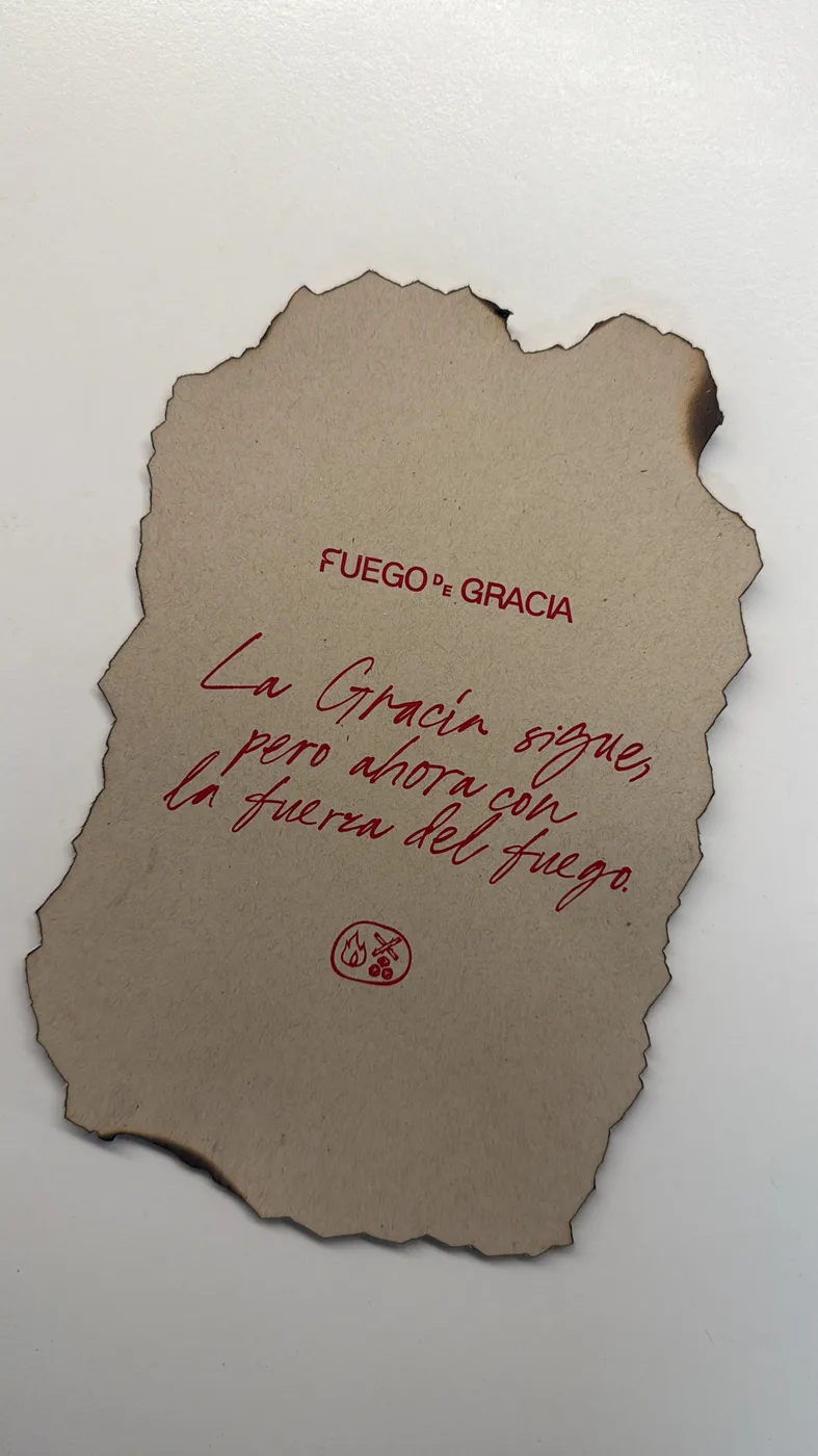
The pitch that never caught fire, with its system fully intact
Credits
- Agency
- Wonder Studio
- Creative direction
- Che Alvizuris · Guayo Bobadilla
- Design & art direction
- Guayo Bobadilla
- Executive direction
- Raquel Alvizuris
© 2026 Wonder Studio · Guatemala · Made in Wonder ✦ Best Believe®